Looking Over 6 Years Of Resume Evolution
Aug 25, 2013
7,000 words on the changes of a resume from 2007 to 2013
The first resume I ever made felt so dearth of material that even at its wordiest, biggest font barely stretched to half a page. God, it was ugly.
I have been making resumes for years now and I have tried to instantiate the same information in dozens of different ways for many different reasons. These resumes have been sent literally hundreds of times to a number of varying results. Regardless of how the resume has looked over time, the goal has always been the same: Present what is there in an eye catching format with quick-hitting, well-written points so that I can stand out over the dozens upon dozens of people who send in their resumes along with mine.
It is not an easy task and as a result, it has led to some unusual choices and some weird directions with regards of both how I decided to design said resume as well as the content I put on it. Some of these choices worked. Other times, they did not. I wanted to take the time to write a little bit (ha!) about why I made these choices, how they worked in the job applicant market, and what I would have done differently. I do not believe that my resume experience is any different from that of other college students and young professionals entering the job market. If by reading this they can help avoid some of the errors that I made then I would be quite happy.
May 2007
I started Berkeley in 2006 and after the first year wanted to put myself out there in the work environment. By then I was wanted to major in business at Berkeley’s Haas Business School. That means you have to go out there and start getting some internships for yourself. I had never worked a job before up until then. Never did any clubs in high school. Never even worked a McDonalds job or anything like of that sort. So I had almost literally nothing on my resume. I was not sure what to do then. It is that age old chicken-and-egg problem: In order to get a job I need to get experience. But I cannot get experience without that first job! What is a kid to do? I dug as deep as I could, exercised every creative muscle, and eventually went with this.
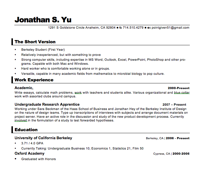
This resume is so sparse and violates so many rules that I feel a little ashamed presenting it right here for you to read six years after the fact! So much wrong. But let me walk you through it bit by bit.
“The Short Version”
This part is especially embarrassing and later on some people called me out on it. This resume is already plenty short as it is. Why would I put in a section headed “the short version”?! I had seen this in another resume that I googled online (one that turned to be something actually long and legitimately needed a “short version”) and figured that it would be a pretty interesting way to catch a recruiter’s eye. I did not have a lot of work experience on the page, but I did feel that I did have some strong intangible capabilities. This “section” would give me the chance to write that down for someone to take into consideration.
It eventually worked in getting me that first unpaid internship, but in the end I dropped it out as my resume gained lengthiness and legitimacy.
Bonus negative points for giving my old high school email address on the top right. Unprofessional email addresses are a definite NO NO!
Work Experience
Considering that I did not have a lot of it. I should have put it at the bottom. Without club experience or anything of the sort, I should have been clear to people just how green I actually was. I did have URAP - Undergraduate Research Apprentice - research experience but even considering that I did a poor job of presenting that information. My URAP experience would be better emphasized if I had decided to break it up with bullets.
There is also an extraneous hanging comma on “Academic”. These sorts of things bother the hell out of me.
Education
Education should have been the thing that went right under the “Short Version” section, being the best thing about myself to exhibit. I had a relatively high GPA (and this would be the case for the rest of my time in college) and did it at a school known for tough grades. If I were to do this resume again, I would take the education section up. I would also set the GPA section in bold and with a bit larger typography (in order to make it more noticeable).
Layout
I am not excited about this layout. This one came through one of the templates from Microsoft Word. At the time I did not know what I should do to make a good resume. Guess it was fine as I lacked the design taste to make something look good as well as the Word proficiency to create it anyway. I really did not know any better. I am glad though that I quickly pivoted away from such a thing in the coming years.
One thing that I have learned over the years is that a lot of resumes look the same. They almost always have the same stupid layout and I think that is tiresome. If you are a recruiter looking through so many resumes with the same set font and look then it means something if you have something just off enough to catch their eye and make them stop. Nothing TOO crazy mind you (and I will make and show you some crazy ones later).
Outcome
This resume looked terrible but somehow through the will of the Lord it got me my first unpaid internship at BTI Group, which was something like a glorified call center with a nice title. However experience was experience and after a few other more qualified people dropped out, I managed to do some time there and get some good experience as well as make some friends. This gave me the first crucial line item in my resume that I needed in order to be qualified for better jobs in the future.
Nov 2007
I was learning a little more about what makes a resume a good one by now as well as improving my own skills at Microsoft Word. At BTI they had resume sessions and I got some good feedback in terms of what should stay and what should go. My earlier resume had been so bad that when people first looked at it they started laughing! Their feedback did help out a bunch and before long I had revised it to look like this.
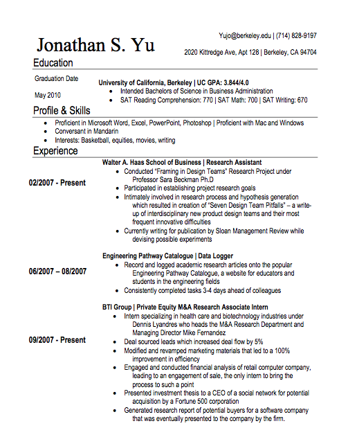
There is definite improvement here from the previous iteration, as well as much more that can be done in order to make it yet better.
Work Experience
I did not know it at the time, but at the time I actually had a fairly decent amount of work experience for someone of my age. It probably did not need to be all the way at the bottom (though being the largest section it remained quite prominent) and should be moved up above at least the “Profile & Skills” section (which itself needs to be renamed to something like “Interests”). However, my reasoning at the time was that though I had 3 entries in that section, not all of them could be considered to be “real” work. Real work meaning that I could say that it took place in an office with supervisors and company revenue banking on it. I also had not been paid for any of the work that I had taken on up until then. That was a real issue for me. It is not real work until money gets deposited into your bank account.
There is the temptation to say a whole lot about your work experiences and achievements there. Later on I found that it did not matter so much the sheer number. Rather, it is what you did there and the substance of your achievements that mattered. Much of what I did at BTI Group people did not really care for.
Most especially, the number and percentages look really dumb looking back on it today. Too round and even in order to be believable. They look manufactured for the sake of impressing a recruiter. In my later lives as a resume reader for positions, I automatically disregarded any term of phrase that goes like: “[verb] deals/students/applicants/events/revenue by [x]%”. Nobody keeps track of that. Not even the revenue stuff because if you are a college student is anyone at a real company going to give you the power or influence to actually grow revenue by that much? Nope so you probably should not be taking credit for it.
In my later lives as a resume reader for positions, I automatically disregarded any term of phrase that goes like: “[verb] deals/students/applicants/events/revenue by [x]%”
Bonus negative points for giving the actual names of my supervisors in the bullet points in my BTI Group experience. Unless it is someone famous, there is no need to have it there.
Education
I had the right idea here moving education to the very top. It became clear to me early on that it was the thing that I should be emphasizing the most. When you do not have a lot of work experience (or even relevant work experience), what should be done is to talk about what you do well. I studied well and picked good classes and my GPA reflected the hard work that I had done. I probably did not need the denominator there “/4.0” and it should be left off the page. Most people understand that this is out of the 4.0 scale. This is not high school where people have like 5.0 GPAs (what the hell was up with that anyway?!).
Some people say that it does not make sense to have an SAT score there. However at the time I still felt very insecure about what I had done up until now and wanted additional “padding” in order to have a resume that seemed “long” and “complete”. I am pretty sure that this was a good choice. Having a short resume like I did back in 2007 was pretty glaring. It stands out but not in that good, “I want you to notice me” sort of way.
Bonus negative points for having the “May 2010” randomly hanging there. Mostly this was because I had no idea how to fiddle around with the spacings in Microsoft Word (not as proficient in the Office suite products as I thought I was …) and get them closer together. Regardless, I should have bolded it to give additional emphasis.
Layout
Layout was definitely improving by now. I had learned enough Microsoft Word to create columns that would add more air and space to the setup. Where before I had the dates of employment and the job title on the same line, which made it tough to figure out exactly how long I was at which place, I had created two columns in Word and arduously aligned the dates and the job details on approximately the same line. It is much easier to read and understand.
I note that this is an impractical thing to do because in the course of job applications, you should be very nimble. You should spend time tweaking the resume before submitting to the listing. This could include things like taking out achievements, adding keywords from the job listing into the resume, or simply adding relevant details like if they do ask for SAT scores (a few do). These tweaks would mess up the formatting and spacing of the column-based resume and you end up wasting more time fixing the alignment of your tweaks than what really matters: Creating good content on your resume.
Might not seem like it matters, but with a resume like this - and there are still a lot of things going against it - I recall anecdotally that I got about 1 callback for every 12 resumes that I sent out. You need to put out a lot of resumes in order to get that job and the time spent tweaking every resume version piles up.
Outcome
Like I mentioned above. I got about 1 callback for every dozen resumes that I sent out. The jobs that I applied to were in general finance related, because that I was interested in, but also spanned the gamut to also analyst and scientist lab technician jobs too. The lab technician jobs I was not at all qualified for (and it is ridiculous that I even tried looking back at it) but the analyst type jobs and the finance type jobs eventually bit.
With this resume, I eventually landed my first “real” job getting paid $9 an hour at a company called FMV Opinions as a private company valuation intern. This was a real “get” because it is a company well known amongst the business types as a feeder position into an internship at an investment bank. But God how good it felt to get some money into the bank!
Other Notes:
-
I was definitely not conversant in Mandarin. When you use that phrase, you have to be good enough to be confident that you can do the interview in Mandarin and not sound like a damn idiot
-
Should have spent more time on the interests, because that often turns out to be the topic of conversation in your interviews
-
Bonus negative points for giving my parents’ home phone number in the top right
October 2008
I did not do a whole lot from the fall of 2007 to October 2008 that required me to revise my resume so it laid fallow for a while. I spent more time applying myself to school - getting good grades on my academic work as well as the undergraduate research apprenticeship from a year before. Also the economy had started to get worse and the callbacks petered out. Things were not definitely not good … but I was not aware that such a financial crisis was just around the corner. Not that I could have done anything about it anyway.
As the crucial junior year internship period approached (crucial because it is the last summer where you can get workplace experience before you start recruiting for full time jobs out of graduation), I had this resume.
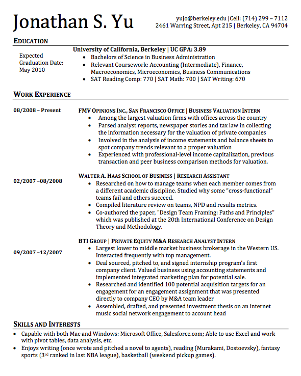
By now you can see that the time I had spent working on my Word skills were paying off and that a definite look and style has started to set in. Many of the concerns that I pointed out in the previous section had been addressed by this iteration. It is surprising. I am writing these recollections (and criticisms) resume by resume - not looking at the next one until I finished with its earlier iteration - and am surprised to find that almost point by point what I notice to be an error is being corrected in future versions right down to the weird spacing in my graduation date (May 2010). It goes to show you just how glaring some of these errors are that I can spot them again so many years after they were made.
Something I especially like with this revision is that I swapped out the previous font for a better one. Times New Roman is a font trusted by many people but God it is ugly and squished up. Switching to Cambria created a much more spaced out and relaxing-looking resume that is easier to read. Recruiter eyes are now spared.
Work Experience
My previous job experience was still making me nervous in terms of what I had done there and whether it was relevant to the kind of work that I was aiming for at the time (mostly jobs related to finance and analysis). Thus, the verbosity. Most of what I had in there in terms of how I phrased my achievements were rolled over from the previous iteration. However I did make some changes like cutting down on the number of bullet points. Four is probably the most anyone should ever go and if each bullet point is already at 2-3 lines that is a lot of text being spent on something that should not be going that long for a 2 month stint. By now it is time to start transitioning out of the “I need to pad and fill white space” phase and start being more judicious about what stays on the resume page and what goes off. It just does not make sense to go crazy especially by then I had held 2 legitimate internships at that point. I should also not have a work experience from a year ago be the longest and most complete thing on my work experience section. This should be reduced and the resultant space be dedicated to my latest work experience at FMV. It is all about the “what have you done lately?” attitude.
By now it is time to start transitioning out of the “I need to pad and fill white space” phase and start being more judicious about what stays on the resume page and what goes off
I was learning better how to adjust the spacing, but the column approach continued to dog me when it came to tweaking resumes. Note that the dates for BTI Group are lower than how it is for FMV and Haas School of Business. I do not think that I figured it out for several years how to actually fix that issue and eliminate once and for all.
About the bulleted text that goes below the job title in Work Experience. It is good that I bolded the title of the job and made it all caps, but now you have all these words that you expect the reader to read below that title. At the same time, the text is actually TWO pieces of information in them with different goals in mind. I wanted to:
1) Explain my role there at the company,
2) Exclaim my notable accomplishments
I think one thing that could be improved is to break out the text that does job no. 1 and separate it in some way from the text that does no. 2. This psychological “trick” makes it easier for someone to read, comprehend and retain the entirety of both pieces of information rather than just random bits and pieces of both. It is easier for someone to understand/retain two smaller pieces of information than it is for them to do the same for one big piece. In this case, what I want them to remember is that the work I have done in my previous jobs is in line with what they are looking for AND that I can do it well for them too.
Believe it or not, this is the type of stuff that I think about when I write and make resumes. I’ll bring it up again in the Education section coming up next.
Education
Education remains the top of the resume as it should be. I resized the font and size of the name of the university and the college GPA then proudly added the “Bachelors of Science in Business” below it. Not sure if this is relevant but should probably add that I went to the Haas School of Business rather than putting the name of the Bachelors. For people who recruit out of Berkeley exclusively (like they use the university recruiting system), the Haas name has cachet. No such cachet exists when you enter the real job world though, so it is just a short term fix.
The coursework I think is too long and verbose. It could use some cutting down as well as some work to space out and make more readable. Right now you have this long four-line block of text that is dense and hard to quickly parse out. If that information is valuable, it is important to add some sort of flair or style that would break the monotony of plain text.
Layout
This is the beginnings of the layout that I am going to use from now on. Knowing how my resume looks today, I can see the seeds of its birth there!
One thing that should be considered with this resume is color. Right now this is very monochrome. Very black and white. What can definitely help and improve this resume is adding a conservative amount of color in order to make it easier on the eyes. A dark red or blue line (replacing the plain black ones that undergrid the headers) might help, as those colors print well in a printer but when viewed in a PDF it helps eliminate part of the harshness of seeing black text on white backgrounds.
In general I think the main flaw of this resume is that it is too text heavy. It is going to be hard for people to read and imbibe all of it.
Outcome
This resume did slightly worse than the last one in terms of callbacks, something like 1 out of 20 that I sent out got callbacks. This eventually would lead me to make some changes in order to improve the callback ratio, realizing that if things were to continue then I would not have anything to do during the essential junior year summer internship period. I picked up a small unpaid gig during the Spring 2009 semester so that I can add something else to the resume, but that was a small thing and would not make a long term dent in my career arc (though the experience personally I found to be quite enriching). I was getting seriously worried.
Other Notes:
-
The text on the top right is aligned weird. There should be more space for my name, which seems a little cramped
-
I would prefer to have my full name there too by the way, as it is unique enough to be remembered
-
I would probably remove the SAT scores though I recall a few listings still asking for it
May 2009
As mentioned above, concerns were growing in me that I was not going to be able to secure an internship over the summer. The economy was as bad as it had ever gotten and improvement still seemed far off into the horizon. This is the resume that I had going into the summer internship recruiting season.
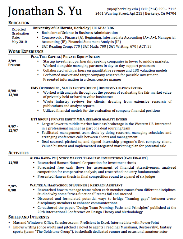
You can get a sense of the general approach that I took with this iteration: SHOTGUNNING! I had no idea what I am going to keep on or off my resume so I was just going to go big or go home. Believe me I was closer to going home than going big.
Activities
One thing in particular that I felt was holding me back (and this was reflected in feedback I received from several colleagues) was that though I had plenty of work experience under my belt at the time, I did not do all that much on campus. I never joined any clubs, never got into the frat scene, or even played an intermural sport. I hardly spent any time on campus outside of stuff done for class or studying (and I did the majority of my studying at home). Thus, I created a new section for Activities, hoping to shore up that particular weakness.
Unfortunately I am not sure that an “Activities” section really accomplishes the goal that I set out to achieve. For one thing, it is less about what you do but how well you do it while you were there. I never participated in any leadership-type positions on campus. The stock market team case competition did not last long and if you did not win then it probably should not go on the resume. I do not think that people really cared all that much about what I put down for activities. I should not have cared so much myself but I was concerned that without this bit of information I would be a far inferior applicant.
Humble-brag here. I believe that winning case study was for something like Caterpillar, which has sucked since 2008. I would like to note that my stock pick choice Hansen Natural Corporation (HANS then, but they switched to MNST in 2012) has returned some 400% since I gave that presentation in November of 2008. Yeah I can pick them.
Layout
The biggest issue here is the lost space from carving out the Activities section in my resume. It is not so much about the fact that I cannot stuff any more job positions in but rather it does not allow me to say a lot about each particular piece of experience. In addition, the contortions that I put myself when it came to fitting as much as I could onto the page meant that this whole thing looked squished and compact. It feels almost foolishly compressed. It takes away from what should have been my strength
Outcome
I got a few callbacks from investment banks with this resume, but in general they passed me by after a first round interview. I was not “banker” enough for them even though on paper it seemed like I had done all the right things. But the education I got both in the office and in the classroom benefitted me in the end as I managed to get a short summer internship at an asset management research firm called Hall Capital Partners. This turned out to be a blessing in disguise as I was able to see the fund investing world and learn many brilliant things. It was also a nice bump in pay for me.
Other Notes:
-
Much of the other criticism I had about the resume still apply here. There should be some color to the lines and some more spacing apart of everything.
-
The coursework in education is just too busy for me right now. There has to be a better way to present all that information - the name and final grade of the course. Even better, why do you need to indicate that you got a good grade on the course? Is that not what transcripts are for? It should probably be removed.
Jan 2010
I had a great time at Hall Capital Partners and shortly after I left, I felt that the resume needed a complete overhaul underneath the hood. I wanted to apply to a whole lot of places and I found that the document’s structure interfered with that. This new update would create the layout that remains at the heart of my current resume. At the cost of being cheesy (then again, I am writing a 6,000 word essay on the changes of my resume, that threshold has long been crossed), I would consider it the iPhone of my resume world! Hah.
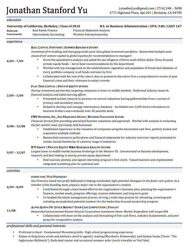
This iteration addresses a lot of the issues I had pointed out as far back as the 2008 version. I still think that layout-wise it looks very good. There would be no problem for me to send it out into the business world as it is. I can address the benefits in the Layout section below.
That being said about the aesthetic, there are still things that I can quibble about with regarding the actual content of the document. Let us go over some of them.
Layout
In 2010 I decided that it was time to restructure the entire resume and start from scratch. I had played around with tables while I was at Hall Capital and decided that it might be a great tool for making an entire resume in Word. The advantages would be that it would create a document that is very well spaced-out and customizeable.
So with the exception of the header - with the name and the address information - the entire document is actually one big table. For the sub-headers, it is easy to color and add flair with the use of shading and cell color-fills. Not only that, the date signifiers are all now placed consistently at the middle of the column without any hassle from me. This removes a big headache.
In general I could describe the entire resume as being very segmented. What does that mean? It means that I can make changes in one section, really wild changes like perhaps including an image, and not have to worry about how it might mess up the formatting in another section because all my wreckage is being committed in a self-contained area of the resume that could be undone and deleted with a single keypress.
I can make changes in one section, really wild changes like perhaps including an image, and not have to worry about how it might mess up the formatting in another section
The use of colors stayed on the conservative side, which I believe kept it tasteful yet attractive. Just looking at it above, you assuage the sense of harshness that one might feel when looking at some of the other resumes in this (increasingly longer) post. The gray shading also helps break out of a monotony of black and white, which has the appearance and impression of being Xerox-ed. This feels in contrast like you are looking at a sparse but multi-colored web page.
Work Experience
The biggest change I made here and one that persists to today is the use of the italics to undergrid both the job title and the place of work. The goal is to give the reader a quick way to understand exactly what I did and where at. The structure is pretty simple. The first sentence gives an overview of the company and the sentence after that would tell them my job description.
I did have issues with the spacing and how many lines should I skip over below and above the italics. This turned out to have tradeoffs. I wanted to include as much as I could in the work experience section, because I felt that I needed to be as impressive as I could be. However, I also felt that presenting a big wall of text to the readers would be counter-productive. When the human mind feels overwhelmed by the sheer amount of information being presented to it, the default action is not to grid down and trudge through it but to simply skip the whole rigamole entirely. Considering the fact that people spend like about 30 seconds to a minute skimming through a resume, this is disastrous. Looking back on how this whole thing is presented, I can afford to take out a few line items like BTI Group, increase the size of the font, and space out things a little bit more. I would look less impressive on paper, but that is what LinkedIn is for, right?
Activity
I remain ambivalent about the use of the Activities section here. My time at strive_for was not very long and my role not all that involved. I did help come up with the name but beyond that my contribution was limited. Considering that not all that many people care about your college activities once you actually get that first job I felt that the space could be better used in some other capacity. I am pretty sure that once I got that first job I dumped this.
Education
The new structure and layout allowed me to edit and change the coursework in the education section very easily. This means that if I wanted to apply to a real estate job, I could quickly swap out Marketing with the Real Estate class that I took several years ago. This allowed me to make a whole bunch of custom resumes very quickly.
Outcome
This resume saw almost immediate success. I would snag a great internship and a full time job with particular iteration. I received a full time offer from Ernst & Young as well as an internship at KKR, a private equity firm. From what I recall, this got a callback as often as third of the time that I sent it out to a job listing. I ended up circulating this format around to many of my friends, who all saw benefits from using it for their own resumes.
Nov 2011
I stopped looking at my resume when I started my full time job at Ernst & Young, but soon enough I realized that my life was not where I wanted to be. I was desperately unhappy doing accounting. So after about 8 months there I left to write a novel. So I did. Left without much of a plan, really. I stayed for about 3-4 months writing my book but then realized that I did not have enough savings to live for very long. I had to go back into the job market. I felt like a retired car heist artist in a Fast and Furious movie: “Just when I thought I was out, they dragged me back in.”
By now I was pretty much used to the process of getting a job or an internship. God I have done it so many times anyway. So I went ahead and dove back into the resume-making process.
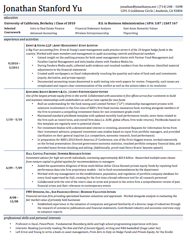
I worked off the most successful iteration of my resume, looking to simply add MORE stuff on. Because I have done so many things at so many different places and I was simply unwilling to drop them, the only way that this could accommodate was to shrink the font and go microscopic. The result is a truly full wall of text that only the most dedicated and interested would ever read through.
Education
This has not changed all that much from the 2010 version. I had graduated already and wanted to indicate that I had a high GPA in a relatively competitive major. However, I felt that as soon as I had left college and entered into my first job that it might make sense to move this down below work experience. Once you are out of college, people do not really care all that much beyond your GPA, major, and the name of university you matriculated from. I should also take out the coursework section. I have never been asked in an interview - a non-technical one, anyhow - about the classes that I took while I was at university. There seems to be a tacit acknowledgement that whatever I learned there would be useless at the workplace.
Work Experience
We got to cut down on that sheer wall of text and get something that is readable here.
I should say that the most recent work experience should be the one most expanded upon in a resume. I did not spend a whole lot of time at Ernst & Young, but leaving all that information off the page because of the “shame” that I felt at having stayed there for such a short period of time is probably a mistake. It might lead people to think that I left for reasons related to my job performance. Also, I only spent 4 months at KKR, why would I have so much detail on what I did there?
FMV Opinions is also really old job experience that should be cut out of the page entirely. I also would take some steps to cut out one or two of the bullet points in my Hall Capital Partners experience. Things two or three jobs ago should not take all that much space on the resume.
Outcome
This resume was much less successful in getting callbacks for fulltime jobs. I ended up drifting for a bit before taking some freelance work with a startup in San Francisco. I had come about their attention through a crazy resume that I posted on the Berkeley jobs site. In a future post, I’ll review some of the experimental resumes and think about the design/stylistic choices that I made for them as well as the results from that work.
Jul 2013
This is the latest iteration of my resume that is complete. I do have an iteration cooking right now in my DropBox but I am still unsure as to what to say about the content in the most recent job experience. Therefore let us take a look at the issues with this one.
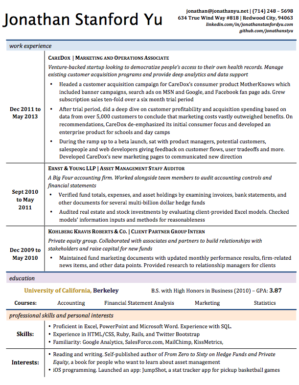
There are a few things to be said about how this looks (and they are things that I directly addressed in the new version that I am cooking up. Things are being fixed!)
Layout
I am not sure about the use of the colors here. While the use of the blue and the gray was tasteful and worked, in this case it seems almost gimmicky here. It interrupts the eye’s flow and the colors clash in an irritating way. In the next iteration, I should probably reconsidering dialing it back a little bit so that people do not get distracted by the weird colors on the page.
Work Experience
CareDox was a great experience, but I should word-smith this down to a few lines. Not telling a novel here. Just want to get the basics of information down. The basics were that I ran a customer acquisition campaign for six months and grew subscriptions from 30 to 300 monthly. However, after this trial period ended, I did an analysis and found that consumer pursuit will be ultimately unsustainable. Thus, I recommended a new direction and the company did that. That should not take 10 lines to say.
Before CareDox and after Ernst & Young, I spent a lot of time working as a freelance marketer for a number of different startups. Some of these gigs did not last more than a few days or weeks and often less than a month. I remain unsure about how to depict this information, which I feel is valuable to potential employers. That being said, I am aware of the problems I had in previous resumes when there was just too much information on the page. There has to be a delicate balance to be struck and to be honest, I have yet to achieve that balance. It still is pretty much up to the job listing. If I have done work before that might align with the experience or the industry, I’ll opt to include it. Luckily the document’s layout makes it easy to make these changes quickly on the go without pain. I also keep a “mother-document” that lists every position that I have worked at and lists my accomplishments there in huge detail. This means that I will not have to wrack my brain trying to remember what I did at this or that place. I just have to go back to the mother-document (or any of my older iterations) and copy that.
Education
I had moved the Education section down to below the work experience. It is time to acknowledge that nobody cares about what school I went to. Should also consider removing the “courses” information. In speaking with employers in and outside of interviews, I never got the sense that they cared about the specific courses that I took. And I never got a callback to an analyst-type job because I took this or that particular course. It is still important information, but I feel that the real message of the resume should be on the particular work experience that I might have that aligns with what they are looking for in a candidate.
With this being the case, I only have about one line in the education section, which might warrant me eliminating it altogether and rolling it under the skills/interest header. This will free up yet more space and allow the resume more “room” to breathe. I had colored the “University of California, Berkeley” header in the Cal colors, but now I think people will not note it enough and instead just find it distracting.
Layout
I have not sent this out into the job market, but previous iterations (modified to match the job listing) have gotten about a 50% callback ratio. This high ratio is mostly due to the fact that I sent resumes out very selectively. If I were to go back to mass-spammage, this ratio would likely fall to something in the neighborhood of 20-30%.
Other Notes:
-
My name header’s font is different from that of the rest of the resume. Fix that
-
In the address header on the right, there are too many links to outside pages. I should probably look to cut those down. Three lines seems to be the most I can do in this particular setup without getting too crowded
-
I always fiddle with the interests sections because it is the one that I find most important in an actual interview. People tend to touch on it during an initial phone screen. You have to be weird, quirky, and passionate about what you do without coming off as a freak
Conclusion
This post turned out to be much longer than I at first expected. I was sure that this was going to be just about 1,000 words or so. However, I had been making resumes for a long time, considering every little part of it, and I leapt at the opportunity to talk about the accumulated knowledge that I have built up.
I know that some people are going to roll their eyes on my talk about “breathing” and “space”, mostly because I have a limited view point on what is going on in the heads of people looking at the actual resume. I acknowledge 100% that there is a bias on my end. Much of the design choices that I talked about here in this long post come from my own viewpoints and I have design preferences that gravitate towards a clean, sparse simplicity. That being said, I am confident that my sentiments are not peculiar and being someone who has reviewed 100s of resumes, I think that even these little things can help put your resume out on the top if you find your resume just one in a sea of similar applications.
I skipped a lot of iterations at the end from 2010-2013, partly because I was gainfully employed during that period and I did not need the resume all that much but also partly because the resume is beyond the point where I can make improvements to the callback ratio through aesthetics and arrangement. By now it is about the experience and whether or not I am qualified for the job that they are advertising for. You can do a whole lot to the look and the feel of the resume, but in the end if you do not have the right education or work experience for the position, you would be hard pressed to assume that you’ll be hearing back any time soon.
Share