Direct Response Principles Demonstrated in Japanese Vending Machines
Apr 26, 2016
Cross-Cultural Marketing
During a recent vacation to Japan, I could not help but notice the polite but fierce competitiveness of Japanese capitalism. Being a business in Japan is tough and it is not just about their labor laws - every shop and store shouts from the top of its lungs. Shops hire street shouters (usually women) to declare their wares and hand out flyers. There are billboards and posters everywhere - on the walls, subways, and buildings too.
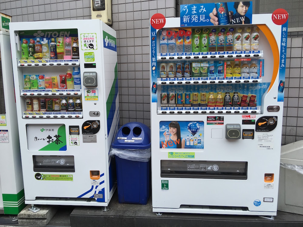
Unbeknownst to most visitors, the battle is not only between men in shops but also the unmanned and automated: Vending machines. Japanese vending machines are myriad in almost every city block - hawking a variety of drinks ranging from water to green tea to coffee (black, latte, you name it, buddy) to even canned soups. Prices range from ¥100 to ¥160.
Much of these drink selections overlap with each other and even competing machines tend to oligopolistic collude on price within a particular block (those dastards!). So all that is left is basically location and - this is where I come in - “eye catchiness”. Namely, their direct response chops. For two years, I ran digital advertisements on Facebook for True&Co, a specialty lingerie company. Much of these advertisements were direct response advertisements, meaning that their intent was to motivate the user to do something. For True&Co, that motivation was to make the user sign up with our site and (preferably) make a first purchase.
In this post, I will examine a number of Japanese vending machines (photographed in various states of hurry on the street) and note the direct response principles their creators invoked (or not) to acquire business. I believe that many of these principles are potentially applicable to your own advertising creative. We can talk about that too.
So without (much) more ado, let’s dive in!
Discussing The Vending Machine Ad Unit
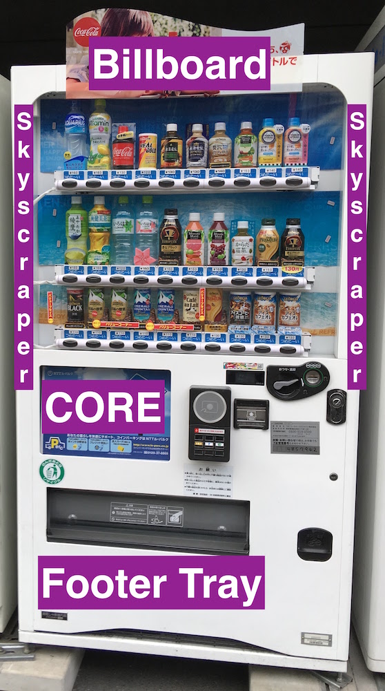
Japanese vending machines are structured pretty much the same way (in other words, they feature a standardized ad unit).
-
Large rectangular billboard ad unit under the drink window to the left or right of the payment module. This is pretty much the core ad unit - all machines have this one, which can be digital at times (useful when playing video). I shall refer to this unit as the “core unit”.
-
Shorter, wider rectangular billboard unit positioned above the drink window. This one is also very common, but not universally so. It often rises above the height of the machine proper, being made of cardboard. I shall refer to this unit as the “header unit”
Other machines add on the frills, taking away their clean look and making them look more like the Yahoo! landing page.
-
Banners on the left or right of the drink window. When used, it shall be referred to as the “left or right skyscraper unit”
-
Banners at the very bottom of the machine, under the drink deposit tray. When used, I shall name this the “footer tray unit”
To be frank, machines that feature the secondary expanded ad units tend to be the newer ones but make up a small percentage of the overall vending machine population as far as I can tell.
Call Out Your Price
Laughing at this tactic will leave you stranded on the high road as your competitors rush away with your customers! Despite me saying earlier that physically adjacent machines collude on price, many still call out their low prices on their core units, especially if that price hits a psychological mark like ¥100.
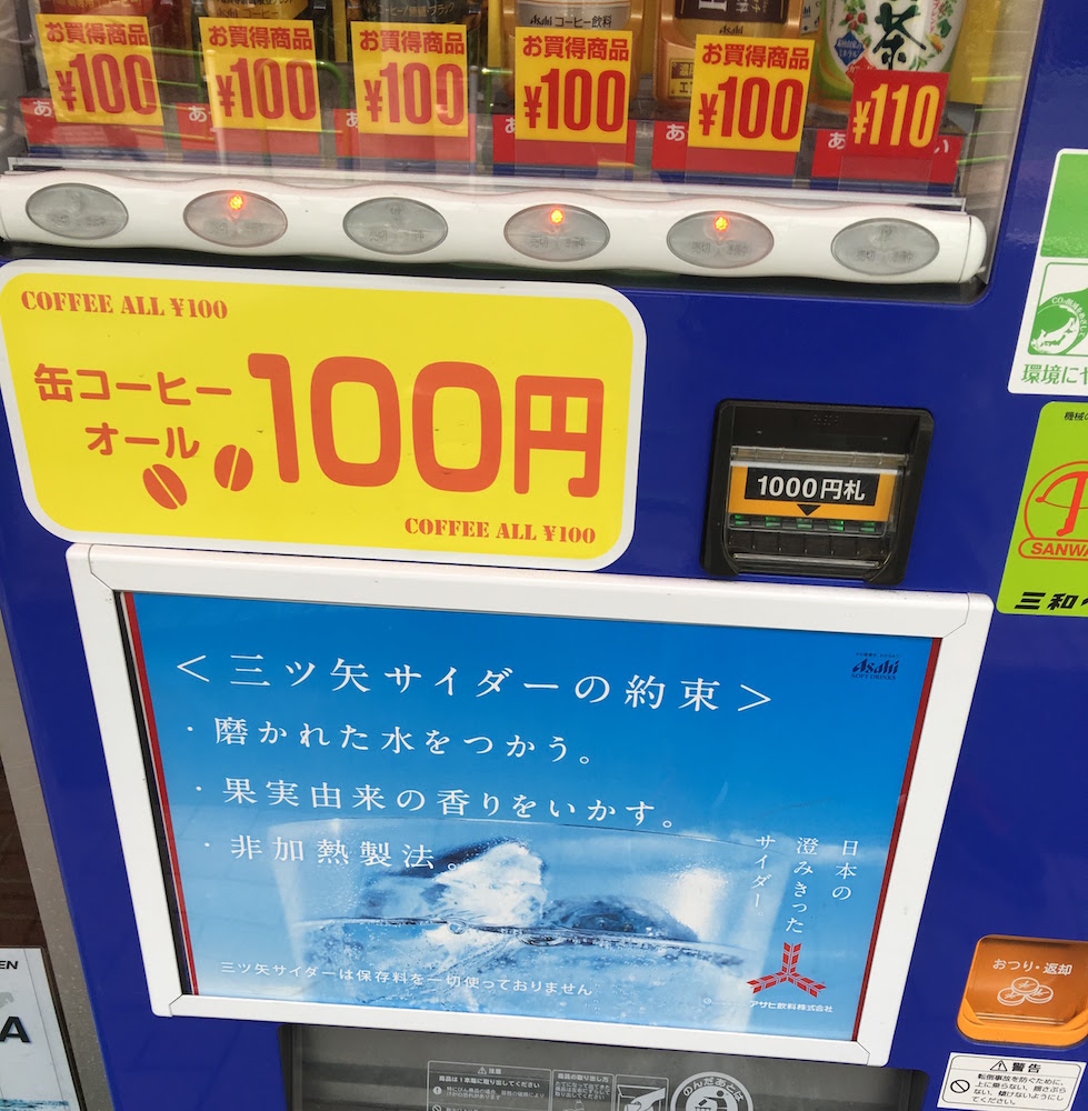
Note this one, which was photographed in Taito. While most of the machines I came across had their advert premises in Japanese, this one made its point pretty clear: With us, you can get coffee for ¥100. The message is made boldly clear in primary (nearly offensive) colors: Red on yellow. The number is the main feature of the core unit, big and noticeable. The secondary message is in English and plastered in the top left and bottom right (the start and end of where Westerns read text)
Call Out Your Brand + Hedge on Price
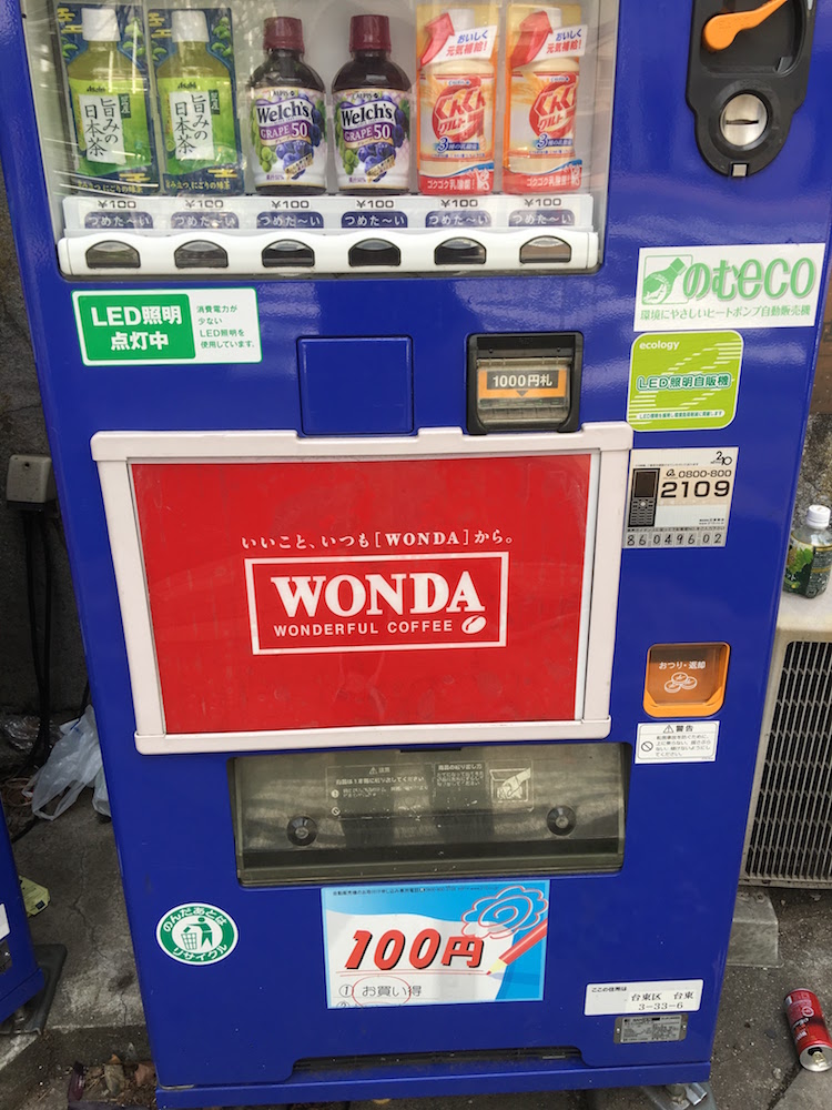
The above machine, “Wonda”, was photographed in Taito as well. It demonstrates a more brand friendly approach to calling out price. The creators chose to fill its core unit with a brand name, that of a coffee brand called Wonda. To maximize the eye catchiness of the ad unit, the background is made a dark red and the text is emphasized by being boxed in by a white line. The subtitle of the logo has the brand’s slogan: “Wonderful Coffee”
Clearly a branding message. The subtitle is too small to be readable by most passersby so the machine is relying heavily on the Wonda name to catch attention (I’m not sure how big of a brand it is in Japan).
However even with this branding message, the machine’s makers hedged their bets by calling out price in the footer tray ad unit: 100¥ again! It is clearly reaching for that psychological barrier, even if only a few of the drinks actually hit that price target.
Get Attention With a Famous Person
These Suntory Boss vending machines are everywhere in Japan, but I regret to inform you that the photos I have of them are rather limited. You might not be able to see it too easily but the image in the core unit is of a Japanese man (not sure who he is?) as well as that of the Western actor Tommy Lee Jones.
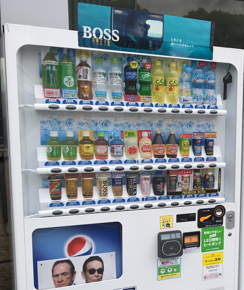
The two faces are well placed at the center of the ad unit and look out at you. Eye contact is better than no eye contact for most direct response image creative. They should be looking at the camera so to better captivate a customer’s attention once caught.
Some of the Suntory Boss machines also feature the Jones + Japanese actor image creative on its header ad units. Others have just the Suntory Boss name emblazoned across its headers (see below). However with very few exceptions the core ad units are featured, which tells me it probably works well for them.
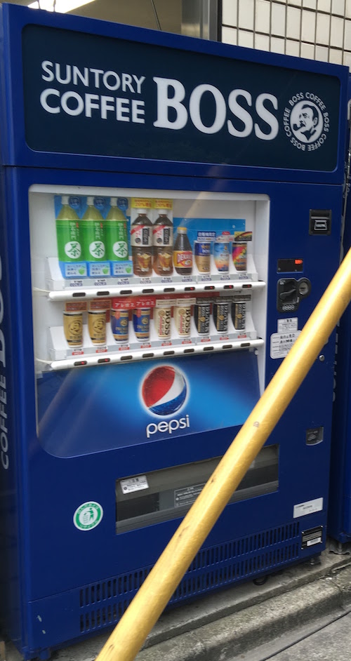
Suntory is well known for using famous names in its advertising (it is one of the first to pioneer the tactic). But to be honest, this tactic is beyond most regular advertisers. How often can we use a famous person’s endorsement to get people’s attention? Most other machines took the tactic of showing an attractive person’s face (see below for a standard example, using a guy and a girl to cover all bases!).
Calling Out Novelty
The human mind is always on the lookout for the next new thing and some of our most successful direct response messaging either called out the novelty of a new item, made note of some “growing” or “impending” trend, or proclaimed of some breakthrough innovation.
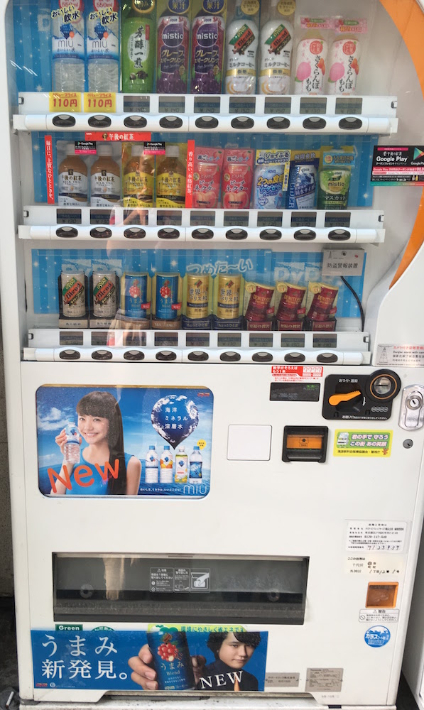
This vending machine takes the tact of just telling people that it has new drinks, with emphasis on the NEW. While I am not the biggest fan of the color and font presentation of the word “NEW” on the core ad unit, it does the job.
For the tray ad unit, I enjoyed the image effect of having the model thrusting the drink in your face. Nice action feel without actually having the action performed.
Design Call Outs
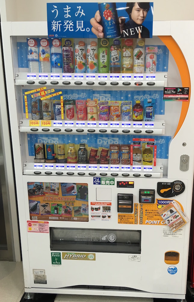
This vending machine uses the same image creative unit from the tray unit in the previous example but that’s not why I am calling it out right now. The reason I like this machine so much is because its window has so many stickers on it that call out specific drinks. On the bottom right there is a red sticker that outlines something they want you to pay attention to. Same with the yellow stickers on the middle row to the left.
In our own digital advertising creative, we found that it helped a lot if we provided some visual cues that helped people understand what specifically we were selling them. Arrows are the best, but outlines tend to fit overall style principles much better (meaning the bosses like them better).
Expanding the Canvas
This is a common occurrence especially for the newer vending machines. Perhaps as advancements in printing came about which let people cut holes in their imagery for the trays and payment modules, advertisers can break out of the standard rectangular format and really go big on their messages.
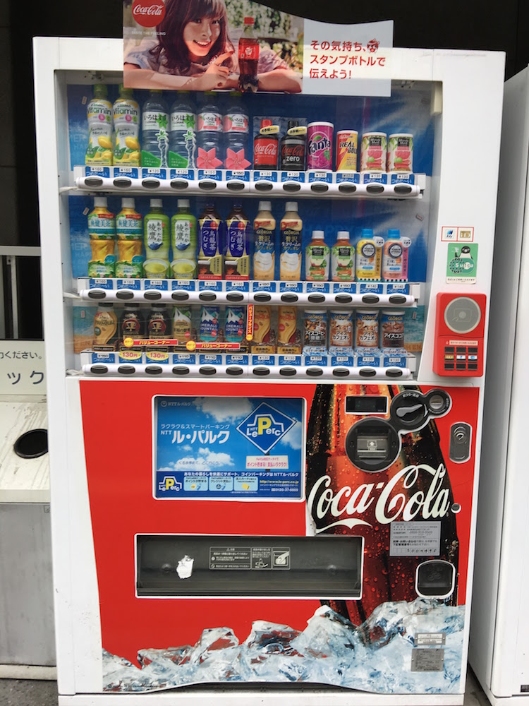
I noticed that Coca-Cola does this the most, using the extra real estate to tell us just how refreshing their drinks are, but they aren’t alone.
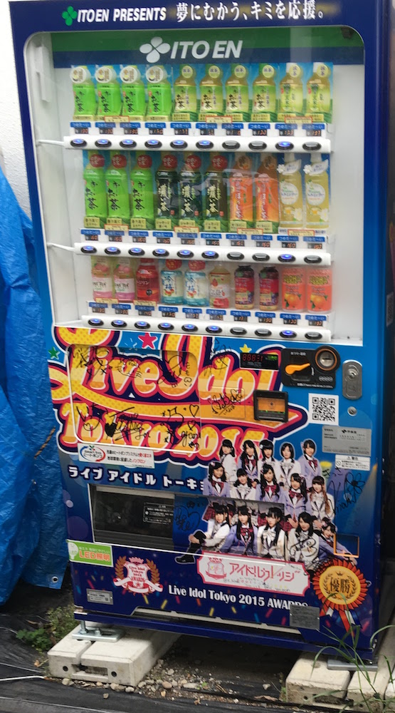
I love that the girl idols in question signed imagery of the vending machine itself! It is a bit too busy for my taste, but perhaps it works for the machine itself. It certainly catches the eye.
Facebook is pretty strict on its ad image sizes so it is not an applicable principle for that format. At the same time, this reminds me a lot of the web page takeover ads that unsavory websites tend to have.
Conclusion
You might think that I am a bit crazy here but I think I really recognized a kindred spirit in these machines’ messaging and visual design. None of these machines were employed as ad units for other products like a movie or something as you might see on a subway support pillar. They are all dementedly focused on one thing: For you to buy from them and them only. Make no mistake, these machines are doing the same thing as your Clash of Clans ads are on Facebook - they’re doing direct response. And I admire that, their little passive battles out in the open of the Japanese streets.
Share